
Before you dive into colors or code, remember: your website’s architecture is the skeleton. The website structure layout determines whether your users stay, click, or bounce. Just as no architect would start building without blueprints, successful web designers understand that structural design for website projects must come first; everything else is just decoration on a shaky foundation.
Turning Confusion into Conversion
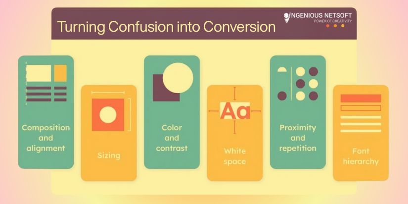
When a mid-sized insurance firm approached our team, their website was a digital maze. Users couldn’t find policy information, contact forms were buried three clicks deep, and the navigation hierarchy web design made no logical sense. The site looked modern but performed terribly.
After implementing a strategic wireframe grid layout and restructuring their information flow, the results spoke volumes:
- Bounce rate dropped from 61% to 34%
- Time-on-site increased by 48%
- CTA inquiries jumped by 64%
The transformation didn’t require flashy graphics or expensive animations—just thoughtful structure. You can explore similar transformations in the ColorWhistle case study archive and browse more examples in the Behance redesign case study gallery.
Grid Systems and Visual Structure
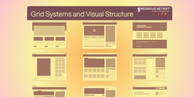
Professional layout planning for websites starts with a solid grid system—think of it as the invisible scaffolding that holds your entire design together. The 12-column grid remains the gold standard not by accident, but because it provides mathematical precision while maintaining visual harmony that feels natural to the human eye.
Why 12 Columns Rule the Web
The magic of 12 lies in its divisibility: 12 divides evenly into 1, 2, 3, 4, 6, and 12 columns, giving designers unprecedented flexibility. Want a three-column layout? Each section gets 4 columns. Need to split content 75/25? Use 9 and 3 columns respectively. This mathematical foundation eliminates guesswork and creates the consistent rhythm that users subconsciously expect.
Building Your Grid Foundation
Here’s how to implement a flexible grid foundation that adapts beautifully across devices:
.layout-container {
  display: grid;
  grid-template-columns: repeat(12, 1fr);
  column-gap: 24px;
  max-width: 1200px;
  margin: 0 auto;
  padding: 0 20px;
}

/* Responsive breakpoints */
@media (max-width: 768px) {
  .layout-container {
    grid-template-columns: repeat(4, 1fr);
    column-gap: 16px;
  }
}
This wireframe grid layout creates consistent spacing and alignment across all screen sizes, automatically collapsing from 12 columns on desktop to 4 on mobile for optimal readability.
Practical Grid Applications
Your content modules become incredibly flexible within this system. A sidebar spans 3 columns, main content takes 9, creating a classic 75/25 split. Half-width sections each claim 6 columns for perfect balance. Hero areas stretch across all 12 for maximum impact. Product cards can be 4 columns wide, fitting exactly three per row with built-in consistency.
The grid becomes your invisible guide, ensuring every element has its proper place while maintaining visual relationships that feel intentional rather than accidental. Users may never consciously notice your grid, but they’ll definitely feel its organizing influence through improved readability and reduced cognitive load.
Advanced Grid Considerations
Modern grids go beyond basic columns. Consider implementing nested grids for complex components, using CSS subgrid when browser support allows, and incorporating vertical rhythm through consistent line heights and spacing multipliers. Your layout planning for websites should account for both horizontal and vertical relationships between elements.
For comprehensive guidance on implementing these principles and diving deeper into advanced techniques, check out Ramotion’s Web Design Layout Guidelines and Webflow’s 7 Principles of Visual Hierarchy.
Mapping Information Architecture
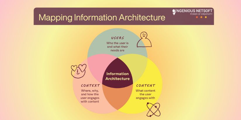
Information architecture UX is where strategy meets structure—the invisible backbone that transforms chaotic content into intuitive experiences. Before placing a single pixel, you need to map out your content relationships and user flows like a master cartographer plotting uncharted territory.
Think of this as creating a UX site blueprint design that guides every subsequent decision, from navigation labels to button placement.
The Content Inventory Phase
Start by conducting a ruthless content audit. List every piece of content your website needs: product descriptions, about pages, testimonials, FAQs, contact forms, blog posts, case studies, and legal pages. Don’t forget the micro-content error messages, form labels, and confirmation screens that users encounter during their journey.
Now comes the crucial part: group related items into logical clusters based on user mental models, not your internal company structure. Users don’t care that your marketing team manages blog content while customer service handles FAQs. They want information organized around their goals and thought processes.
Visualizing Relationships and Flows
Use tools like Figma, FlowMapp, or FigJam to create visual representations of these content relationships. Start with card sorting exercises, write each piece of content on a digital card and experiment with different groupings.
Look for natural patterns: What content do users need before making a purchase decision?
Which pages logically connect to each other? Where do users expect to find specific information?
Create user flow diagrams that trace the path from initial awareness to desired action. Map out multiple scenarios: the research-heavy prospect who reads everything, the quick decision-maker who wants immediate answers, and the returning customer who needs support. Each path should feel natural and unforced.
The Psychology of User Expectations
Ask yourself these critical questions: How do users naturally think about your content? Do they categorize your services by industry, by solution type, or by company size?
What mental model do they bring from competitor websites or industry standards? The most elegant information architecture UX design works with user expectations rather than against them.
Consider the progressive disclosure principle revealing information in layers based on user commitment levels. Surface-level browsers get overview information, while serious prospects can dive deeper into technical specifications or detailed case studies. This approach prevents cognitive overload while satisfying users with different information needs.
Tools and Templates for Success
The Figma Website Structure Guide offers excellent templates and methodologies for this crucial planning phase. These resources provide proven frameworks for organizing complex information hierarchies and testing different structural approaches before committing to development.
Remember: your UX site blueprint design isn’t just about organizing what you have, it’s about creating pathways that guide users naturally toward their goals while achieving your business objectives. When done right, users shouldn’t even notice the architecture; they’ll simply find everything exactly where they expected it to be.
Expert Opinions & Industry Validation

Industry leaders consistently emphasize structure over surface appeal. Jakob Nielsen, the godfather of web usability, reminds us: “Users spend most of their time on other websites. This means that users prefer your site to work the same way as all the other sites they already know.”
Vitaly Friedman, editor-in-chief of Smashing Magazine, reinforces this with:
“Design systems exist to serve clarity and function. The most beautiful UI means nothing if users can’t find what they need.”
These aren’t just opinions they’re backed by data. The Baymard Institute found that 76% of homepage task failures link directly to poor website architecture design decisions. When information architecture UX fails, even the most stunning visuals can’t save the user experience.
Dive deeper into these findings at the Baymard Institute Homepage Navigation Study.
Learning from Mistakes: Building Trust Through Structure
I once inherited a website that looked award-worthy but converted poorly. The client had invested heavily in custom animations and artistic layouts, but users couldn’t complete basic tasks. The structural design for the website was fundamentally flawed.
We rebuilt using Core Web Vitals metrics, Lighthouse audits, and analytics overlays to guide our decisions. The lesson? Pretty pixels can’t fix broken paths. Users trust websites that work predictably, not ones that surprise them at every turn.
For technical guidance on building trust through performance, explore the BrowserStack Responsive Design Guide and Kinsta’s Responsive Web Design Guide.
Visual and Interactive Tools for Designers
Teaching layout planning for websites becomes more effective with interactive elements. Consider adding quiz components to help users identify their structural weak points, or create interactive wireframe builders that demonstrate good hierarchy principles.
Tools like Canva’s Quiz Maker and Genially Quiz Templates can transform passive readers into engaged learners, helping them internalize these crucial concepts.
Website as a City Plan
Think of your website structure layout like urban planning. Your homepage functions as the town square, the central hub where visitors orient themselves.
The navigation hierarchy web design acts as your subway map, clearly showing how to reach any destination. Call-to-action buttons become street signs, guiding traffic flow, while your footer serves as the information kiosk where visitors find additional resources.
Just as city planners consider traffic patterns, pedestrian flow, and accessibility, web architects must think about user journeys, content hierarchy, and inclusive design. A well-planned digital city makes residents (users) feel confident and comfortable navigating independently.
Learn more about applying these hierarchy principles at GeeksforGeeks on visual hierarchy in web design.
Structure Trumps Surface
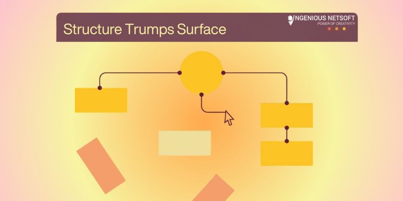
You can’t fix poor structure with pretty visuals. The most successful websites prioritize website structure layout and structural design for website planning before considering aesthetics. Start with flow design will follow.
As I always say: “You can’t fix poor structure with pretty visuals. Start with flow. Design will follow.”
The foundation determines everything that comes after. Invest time in planning your architecture, and every subsequent design decision becomes clearer, more purposeful, and more effective.
